Mesh Magazine
Overview
In response to a three month, solo, upper level publishing course project brief which requires the development of a magazine publication from the ground up, Mesh magazine was created. I developed Mesh as a (proposed) publication intended for open-minded, young individuals looking to break the binaries and boundaries that restricted past eras, even if this means causing controversy. The publication is devoted to the three core areas–fashion, art & culture, with an overarching theme of dissolving unnecessary societal restrictions and empowering change. After developing the magazine's core concept and drafting inital concepts, I took to BlinkPlan, InDesign, and Photoshop to continue planning and designing the publication.
Initial iteration
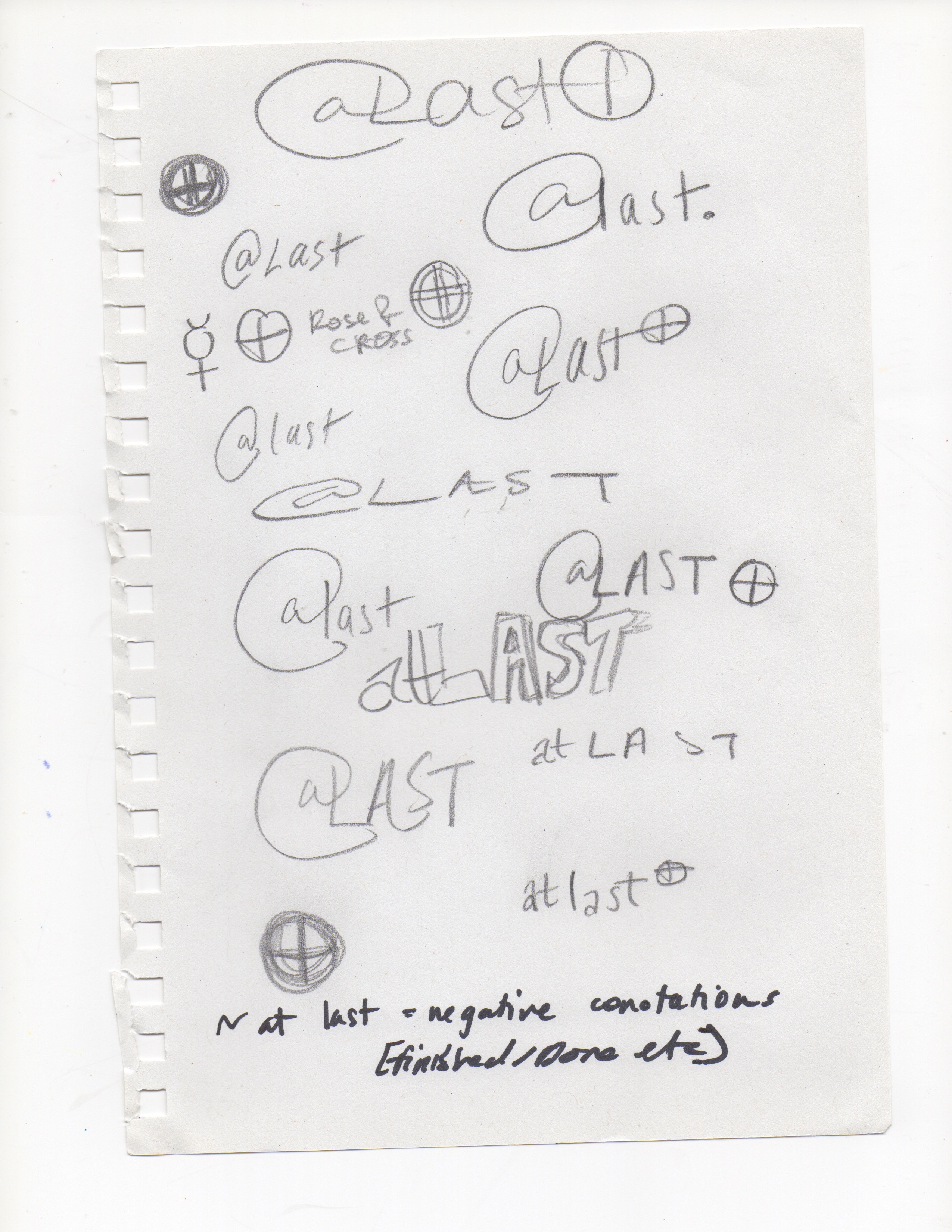
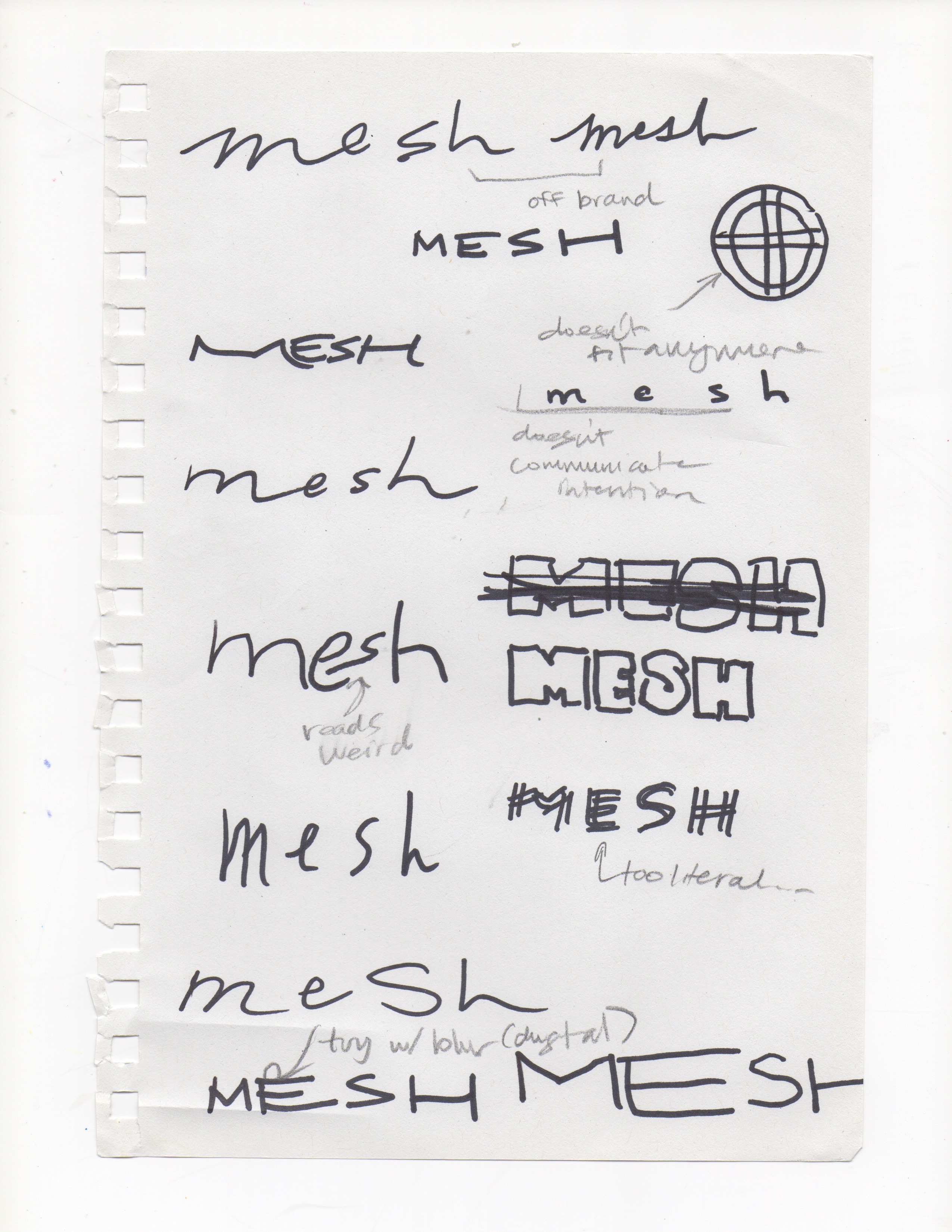
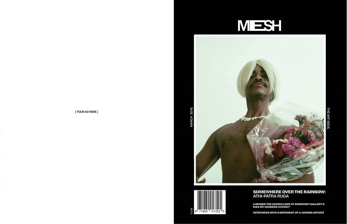
Arguably the most difficult part of this project was designing the identity of the publication. While I knew that I wanted to create a magazine which revolved around art, fashion and self expression, it took me a while to pin down the exact type of reader I was trying to cater to. This resulted in an iteration phase of my publications name and brand identity, as I wanted both its copy and design to directly reflect my intended audience. After exploring similar types of publications and going through a couple iterations (as shown above), I finally decided on a name that would work–Mesh, a publication for open-minded individuals looking to break binaries and boundaries even if this means causing controversy.
Identity development
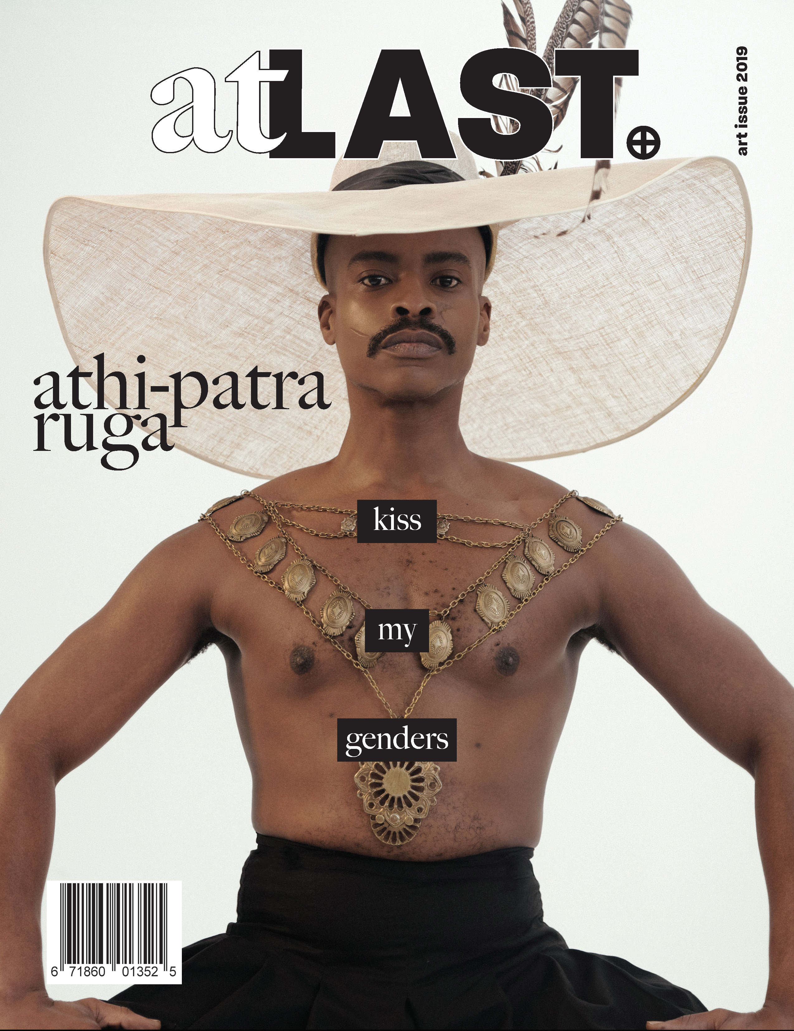
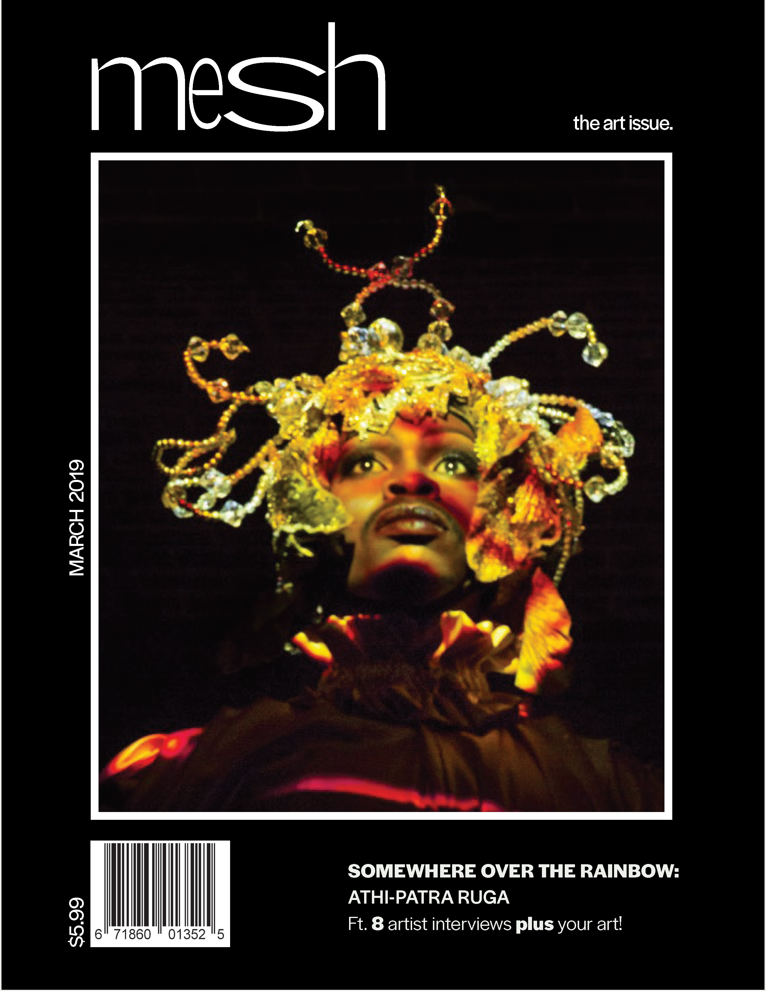
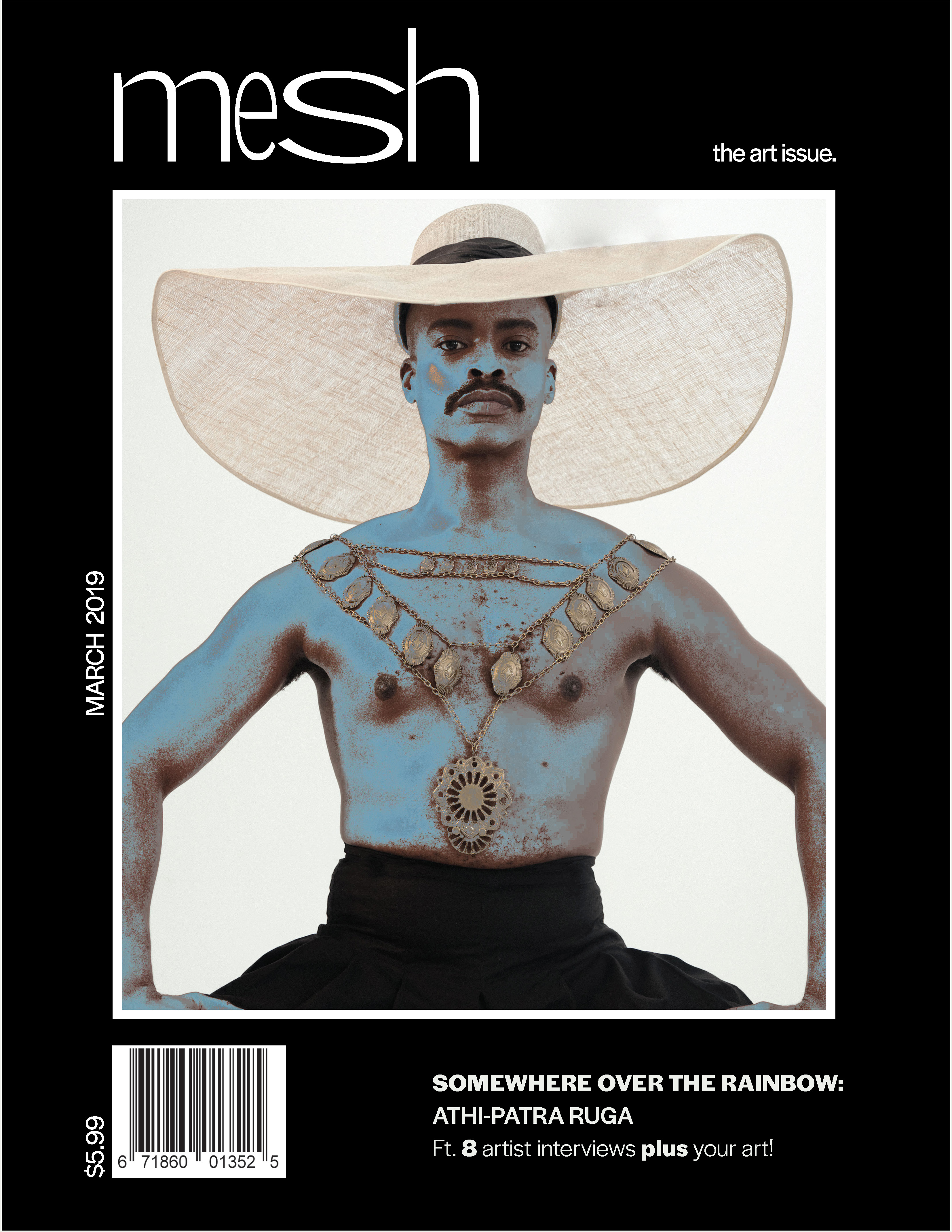
To adhere to the brand guidelines I had identified for Mesh Magazine, bold, expressive content features were used all across the publication to keep it feeling exciting and young. A combination of serif and sans serif type was used to create dimension and excitement. Blown up quotes were used to highlight the voices being shared within the editorial feature and carefully selected, large scale images where used to showcase the artists work. Since shooting or commissoning my own photography was out of the scope of the project, I carefully selected images that worked together within the spread and used them to drive the supporting typography and graphics.
Supporting artifacts
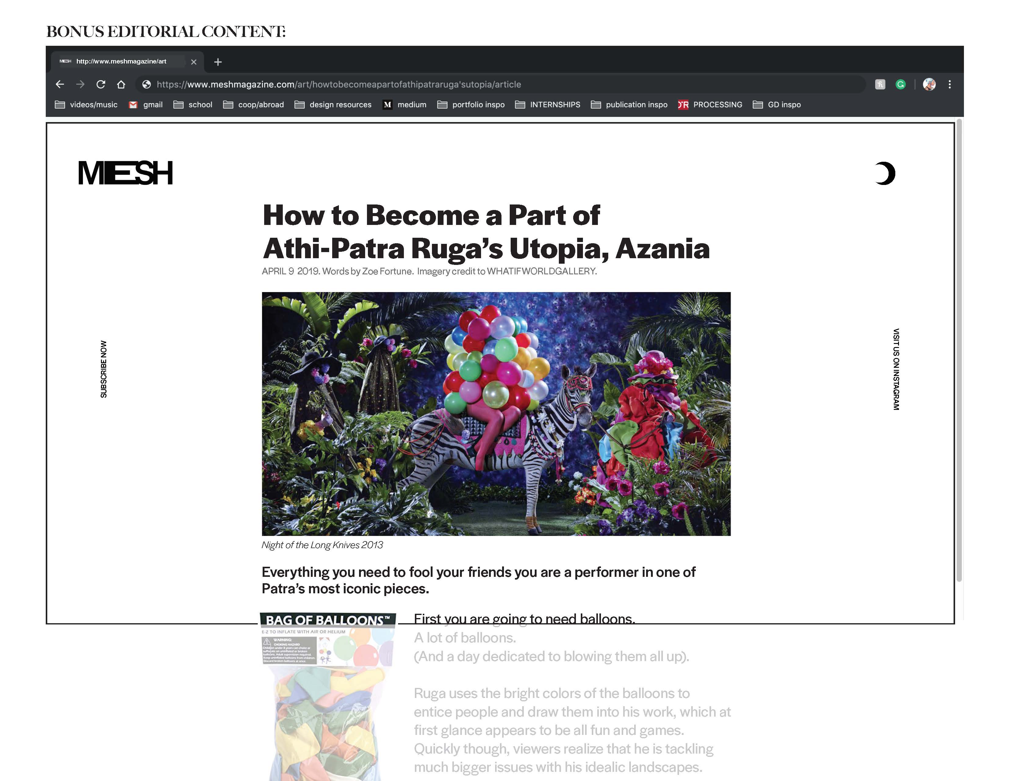
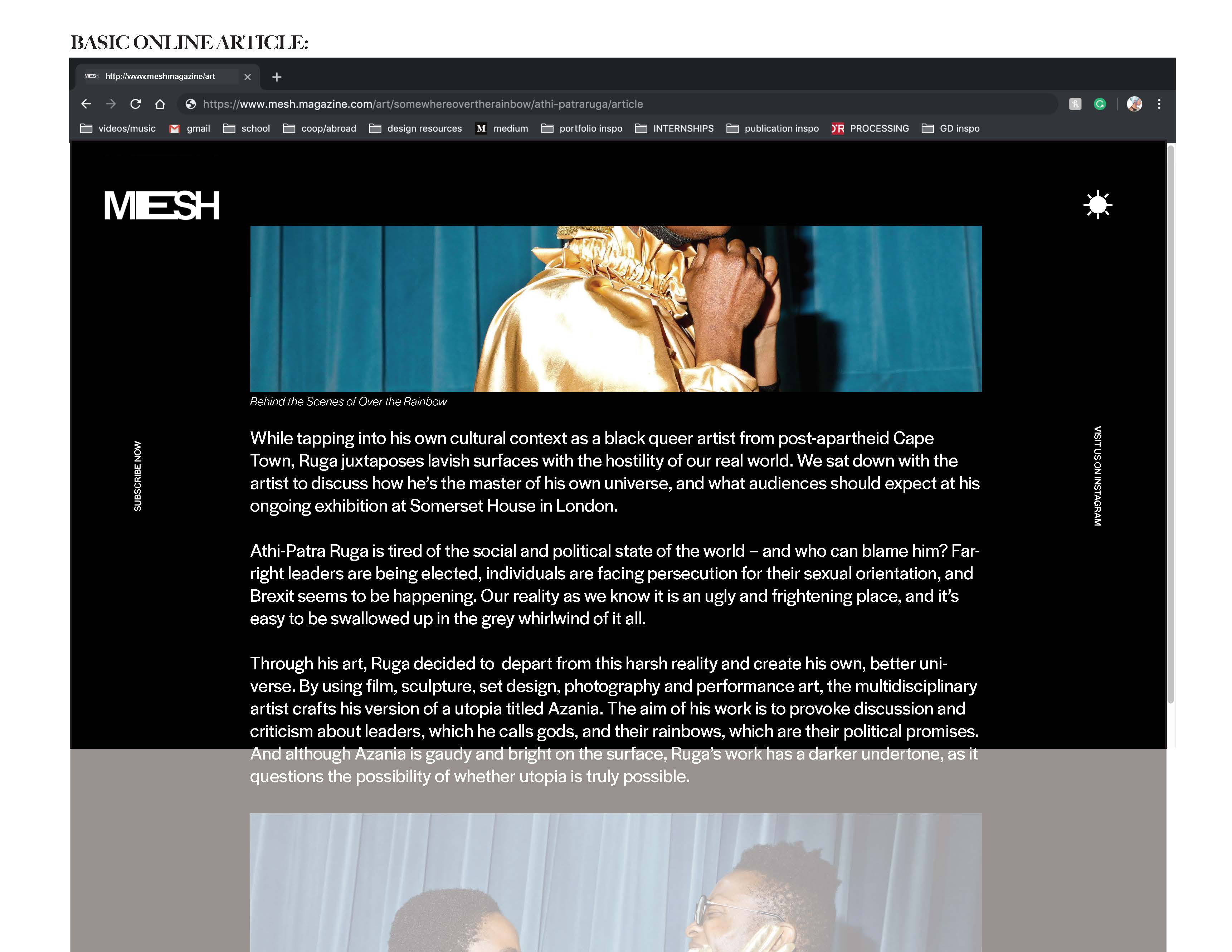
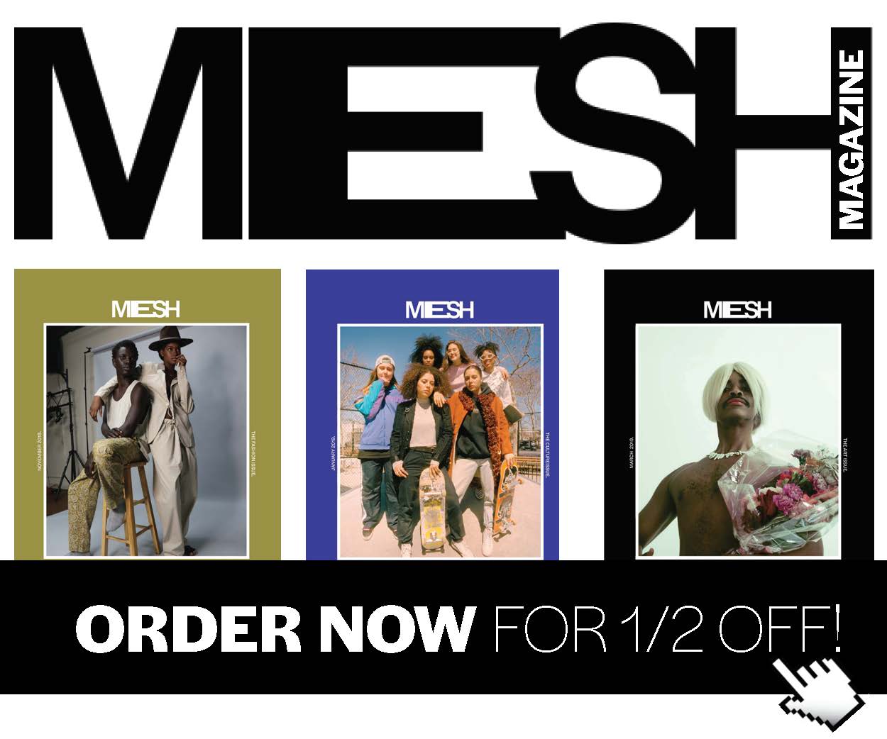
The aforementioned brand identity and style guide developed was translated into supporting material including subscription cards and digital content. This process emphasized the importance of creating clear brand guidelines, as it was much easier to complete these supporting materials after having established this.
End result & insights
The final publication mockup was one that I was incredibly proud of. My work was used as an example for future students following the same project guidelines and I was encouraged to bring the content I had proposed to life outside of the classroom due to its high level of polish.
This project helped a lot in my understanding of and ability to navigate InDesign, working on this project for three months meant constantly working on the software and discovering new features. The critique I received at the different check in points for this project was very influencial in the final concept and design, this project helped with my ability to let go of a design completely if it is not working.
View a complete collection of Mesh Magazine assets (links externally).