Wealthsimple Journey
Overview
Wealthsimple is a Canadian robo-investment app that focuses on making meeting financial goals accessible.
Wealthsimple Journey is a proposal for a financial literacy tool embedded in the Wealthsimple site that aims to make the idea of investment more approachable, highlights its benefits, and dispels myths surrounding the subject. It is targeted at those who grew up with financial instability or have cultural, emotional or psychological barriers to or the idea of investing.
The project was built by a team of 5 and spanned 4 weeks, 1 being an intensive Google Sprint where we gained insights from members of our target demographic, ideated proposals to research based areas of concern, and prototyped and tested our intervention before refining for the final proposal.
Research Driven
After conducting initial research from reputable sources in the investment space, as well as Wealthsimple itself, we developed a questionnaire that would target people’s thoughts toward investing, as well as their habits surrounding money in order to gain a better understanding of our problem space.
Through the questionnaire with 134 respondents, we found that people often did not invest either due to financial insecurity growing up, or financial illiteracy due to a lack of discussion of the topic between themselves and their parents or caretakers.
3 qualitative interviews with people who were all people that were financially capable of investing (i.e not in debt) but were not currently doing so were also conducted. From these, we found a common barrier to investment was the lack of resources about the subject that felt relatable. Interviewees cited finding information on investing from big time Wall Street stock bros or influencers who already had thousands of dollars, but nothing about people who were working multiple minimum wage jobs or knew what it felt like to grow up without money.
We were also able to test our prototype across 3 levels of fidelity with 11 users with the intention of validating our initial ideas first, then validating the flow and purpose of our design before testing our final prototype. To measure the success of our proposal we analyzed positive feedback from testers as well as system usability scale results. Results indicated that testers felt the design of our platform was both easy to use and felt useful, with no one rating the platform lower than a 4/5 in these categories (learnability, satisfaction, understandability and efficiency).
Implementation
Each component of our intervention was heavily driven by interview and survey responses. For the onboarding portion of this platform, we highlighted both common reasons our target audience might want to invest, whether that be to save up for a car, a vacation or to help their parents retire, as well as why many do not invest.
Our research showed that people want to see other people who are in similar positions to them, who might’ve made some mistakes with their money, or who started with little money besides the $10 incentive that comes with signing up. So we incorporated the ability to be able to see the stories of others who signed up for Wealthsimple after using this platform.
There are two ways to access stories, the first (left) is an iteration of my initial ideation during our sprint, that encourages exploration and play by allowing users clicking on the money icons as they float around the screen. This method is intended for those who are not looking for a specific situation to relate to. The second (right) allows those who are looking for someone who is in their shoes exactly to filter results to meet that desire.
The actual stories share information such as personal reasons for investing, where the person started, how they continued and any setbacks they might have had. We highlighted both factual and emotional information as we saw a divide in the demand for these things in our research findings.
Finally, we found, through our survey responses, that there were a number of myths surrounding investing that were preventing people from getting into investing, so we incorporated a section which highlighted and disproved these misconceptions.
Creative Direction
While the creative direction of this product relied heavily on the existing brand identity, we also extracted core brand pillars of Wealthsimple that could be applied to its voice/tone and art direction. To ensure the sight was accessible, we chose to use refined jargon-free language expressed through bold legible typography.

To emphasize the approachable nature of the platform we chose to incorporate bright colours and playful imagery; while real photography and video footage was recommended to enhance the credibility of the platform.
Approachability
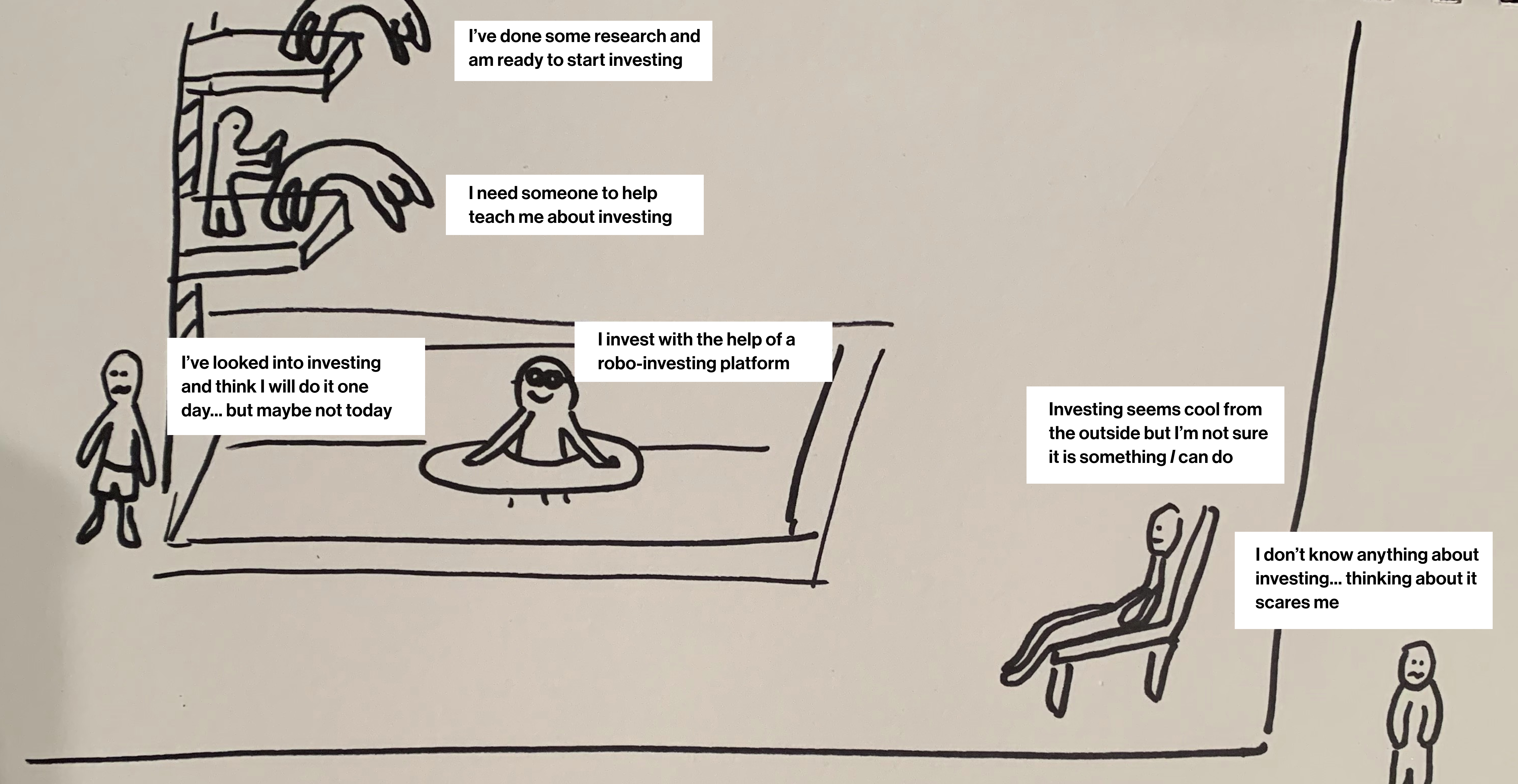
During our sprint week, something I was focused on was finding ways to communicate aspects of the investment process in a way that was quickly identifiable and relatable for people as they approached Wealthsimple Journey for the first time. The image above showcases an analogy I proposed for people to be able to quickly identify where they were at in their investment journey in a way that did not feel shameful, but instead incorporated fun by leveraging a playful graphic that many would be able to identify with: swimming!
This idea was well received by the team as it felt like a friendly way to onboard users to our platform, but was ultimately rejected only due to project time constraints as it would have required strong, preferably 3d rendered graphics to communicate in the way it was intended.
End result & insights
The video above showcases the final product of the initial 4 week project + small refinements made in the course of 1 week for the purposes of submitting the project to the Vancouver UX awards in March 2023.
While this proposal was heavily research backed and tested, and was well received in our proposal to industry professionals, it is recognized that much more research and prototyping is necessary to get this to something that could be pitched to the actual company. Primarily the subject of security is of concern as this proposal asks users to share their personal information, and so if this project were to move forward, looking at how to keep people’s information and security safe while maintaining credibility and reliability is something that we would definitely look into.